PáRAMO
Piura, Peru 2019Social Practice, Community Art, MARKETING, ART+BUSINESS WORKSHOP, BRAND DEVELOPMENT & DESIGN
PÁRAMO is a brand For a farmers cooperative in northern peru that Louella aquino helped develop through one of her arT+Business workshops.
Summary: In 2019, Louella Aquino partnered with Nature and Culture International (NCI) and helped a group of farmers create a collective brand for their farmers cooperative. Aquino designed and led a series of workshops teaching about marketing and brands; then led a group of over a hundred farmers develop their brand and logo which the farmers now use to sell their coffee, cacao, and panela (raw brown sugar).
Nature and Culture International (NCI) had been working with farmers in the northern region of Peru on creating a cooperative. NCI had been educating the farmers the value of working together versus against each other and driving down the price of their crops. Most of the farmers in this region, or in Peru for that matter, come from a lineage of farmers and like their fathers and grandfathers before them, farm because of necessity and survival. Farmers are often at the mercy of the elements like the sun and rain; and the revenues their crops yield are often subject to the prices and demands set by buyers. By organizing the farmers and helping them form a collective, NCI hoped to help the farmers create products with standardized quality benchmarks that could help them enter more formal markets, attract new buyers, and overall increase the price of their crops so that they could improve their lives. NCI asked me to help create a collective brand for the farmers cooperative that all the farmers would agree on and would still give them flexibility to showcase their individual product’s identity.
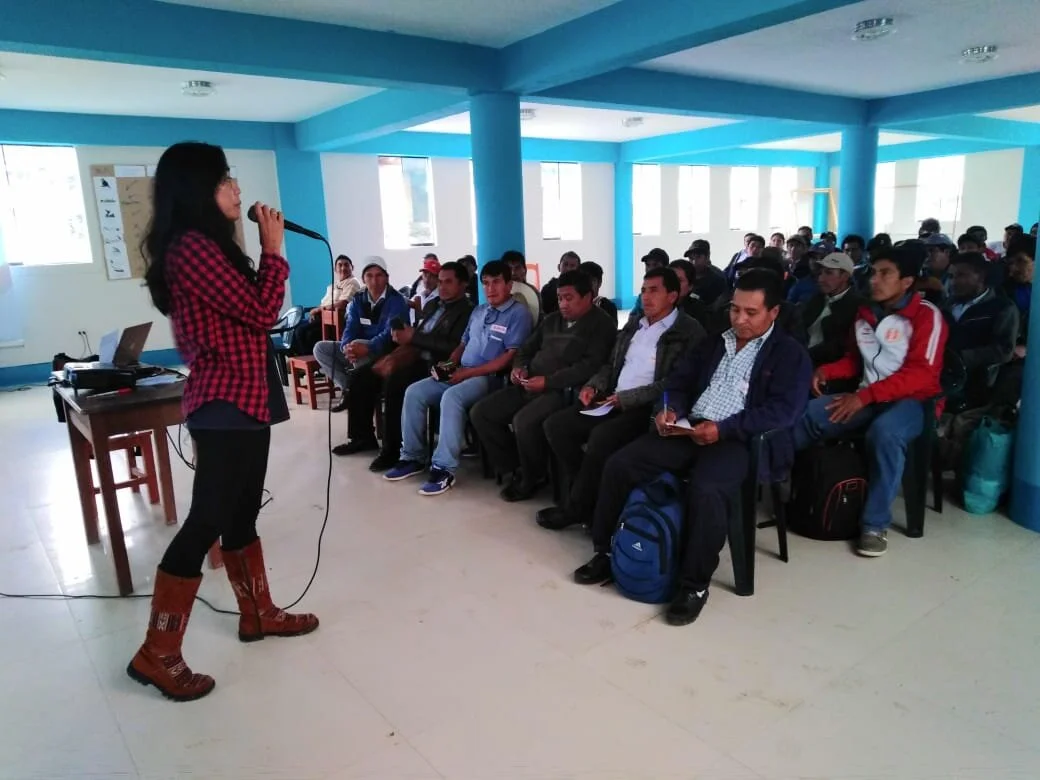
Partnered with the Nature and Culture International (NCI), I travelled six hours into the mountainous region of Piura to meet with over a hundred farmers. I could have easily design a logo and brand for the farmers’ collective when NCI asked me to, but that wouldn’t have helped to convince all of the farmers to use it — and I didn’t feel comfortable creating what was supposed to be the identity, even if for business or marketing sake, for a group of people from this different culture. Although the color of my skin was much closer to the farmers than most of the people I had grown up with back in the United States, I was very aware of my outsiderness. I didn’t want to approach the group of people who had asked me to help them that I was the one with the answers, but rather that they were capable enough themselves.
The 2-day workshop had a full program thanks to the coordination of NCI. My workshop was just a small part of it, but having full control of my segment I treated it like a 2-phase collective art project with the goal that the farmers would determine their cooperative’s brand identity. Towards the end of the first day’s program, I started my workshop by reviewing concepts of marketing, branding and logos that I had already spoken to most of the farmers about in our smaller workshops and our first introduction when I visited their farms and small towns the prior month. I spoke a little about large umbrella brands like Procter & Gamble and how they work in the United States, but I relied more heavily on Peruvian brands that the farmers would recognize. I reiterated the value of what a collective logo or brand would look like, but that the farmers would still be able to showcase the individuality of their products and towns by creating product lines, or communal brands, under the collective or umbrella brand. I used imagery of a small fish versus a big fish to illustrate the risks the farmers would run into if they all individually tried to make their own brands to compete with larger, established, and well-known Peruvian brands that have built their brand identity over time with lots of resources. I illustrated how if they work together, like a school of little fish, they could have a chance to take on the bigger fish. the This is all done in Spanish, of course.
Next, I asked the farmers to huddle in groups and brainstorm ideas for names for the collective brand. I give them markers and construction paper. I told them to think about the network of farmers they were a part of, their land, and imagery that comes up — and to write down everything. Next, we had representatives from each group huddle share their ideas. Some names had to be scrapped because they were too long or too logical (like from the group of farmers in the northern Andino region of Peru), but some were decent and had a good shot of being developed into something more, something beautiful, and something that could represent the group. From there the whole group of farmers, over a hundred of them, voted on the top names.
We landed on “Páramo” which is a Spanish and English term (in simple non-science language) for the ecosystem at the top of the mountains.
I concluded my workshop that first day and began working on different designs for Páramo throughout that night. I took a break for dinner and the farmers introduced me to the game of Peruvian cornhole that uses a small puck instead of a hackysack and the hole you’re aiming for is literally the size of the puck. The farmers introduced this game to me as tejas or tejos — and it’s not quite the same as the Columbian sport of tejo but probably a variation. This Peruvian cornhole game is also a drinking game, so if you miss you drink — and you drink a type of Peruvian moonshine made from sugar cane. I’m with my friend from NCI who is another female, so we stay around for a little while until we decide that our little bodies shouldn’t drink more cañazo. I feel like I really made my way “in” with these farmers, drinking cañazo, playing tejos, and even getting a puck in the hole. And then a massive bug, maybe it was a cicada, lands on my leg and I freeze in fear exposing myself for the true city girl I am. One farmer says not to be afraid while I stand frozen in fear, but I keep my cool and muster the courage to brush the massive bug off nonchalantly. The night continued in camaraderie and cañazo until my friend from NCI and I infer it was time to leave.
Warm from my success in developing new connections with these farmers and the cañazo, I went to sleep that night dreaming of more designs for Páramo; and woke up the next day, energized by the beauty of mountains, I set to work on developing actual potential logos. I started with the word the group of farmers had settled on the day before - Paramo - and made a triangle to represent a mountain, then the triangle became green to represent nature, and then I added a second smaller triangle and then a third so it was a group of mountains, but then removed the third triangle because it didn’t look good. I played like this for several iterations, until I felt like we had a good working prototype. Before the second day’s session, I spoke with NCI who gave their feedback: like adding in the accent mark over the ‘a’ which I had forgotten or making the entire word capitalized (which omits accent marks in Spanish), a squiggly line to represent water in the mountain, and a fancier ‘P’ that was slightly reminiscent of the Disney logo.
In my second and final workshop with the group of farmers, I had several prototypes that had taken into account NCI’s feedback and with the farmers, we did another round of iterations on the brand. Unlike the prior day’s workshop, the farmers in this session were more vocal and participative by giving their own comments, suggestions, and even creating stories. There was discussion if there should be one squiggly line or two or if the squiggly lines should meet and intersect like how the rivers did on their mountains. A final vote within the group revealed the latter as the cooperative’s choice.
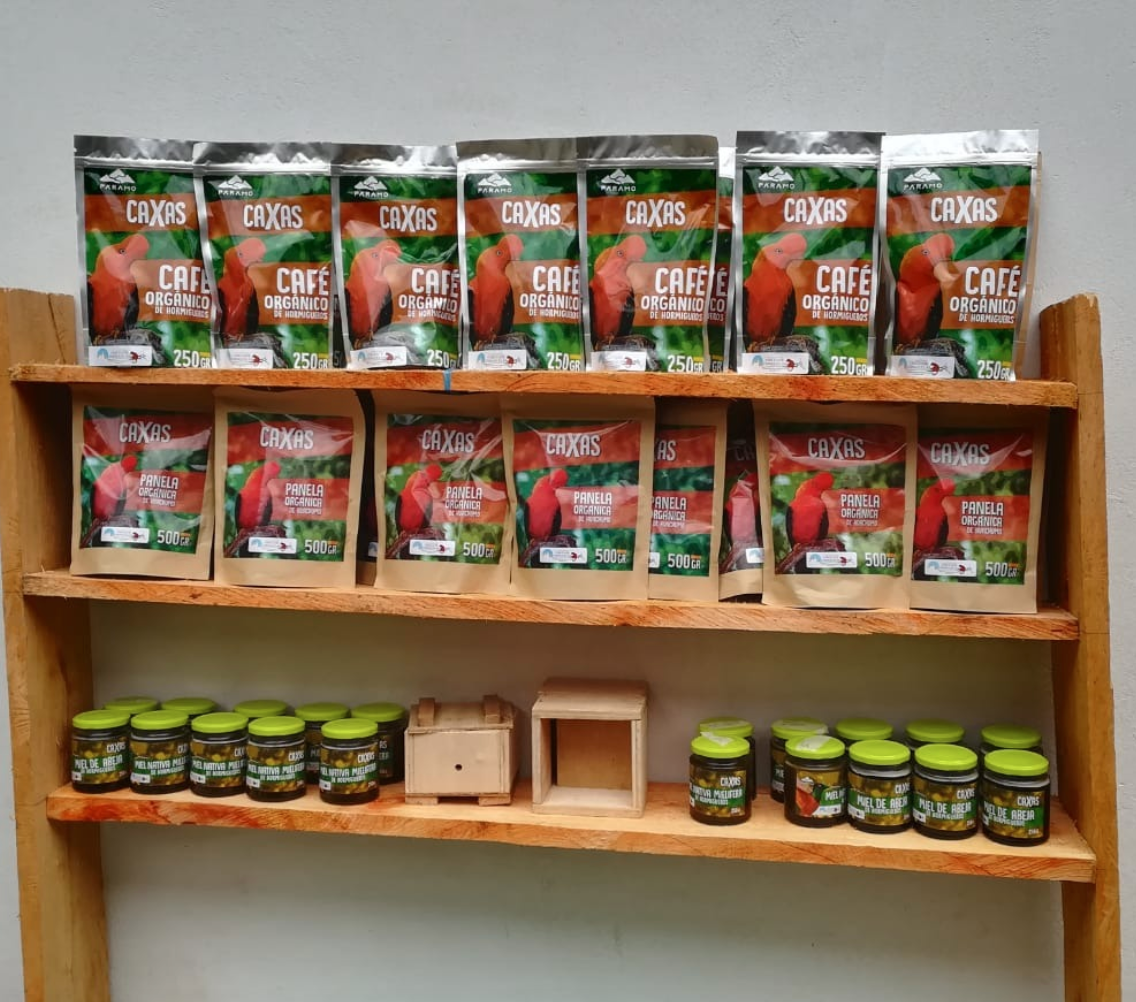
NCI used this prototype and worked with a local graphic designer to create the final official logo. The conversations that my workshop helped facilitate among the farmers was incredibly useful in developing the brand’s logo prototype, but more importantly it the 100+ farmers bought into the idea of a collective brand. NCI sourced local labor to develop the logo onto ecological packaging that the farmers now use to sell their coffee, cacao, and panela (raw brown sugar).
Timeline Summary
Beginning of August 2019 Louella meets with Nature and Culture International to discuss business and creative needs
Mid-August 2019 Louella starts to visit individual farms and conducts small workshops to introduce herself and introduce marketing, branding, and business concepts.
End of August 2019 Nature and Culture International plans farmer conference and invites Louella to do workshop with 100+ farmers. Louella plans workshop.
September 2019 Louella conducts workshop
End of September 2019 Louella helps Nature and Culture International find a local graphic designer and finalizes logo
October 2019 The Paramo logo is official and printed on packaging for coffee, cacao, and panela (raw brown sugar)
See the Google Presentation that Louella Aquino used to facilitate her workshop here


